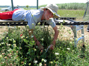
Sean Mooney, a high school researcher, collecting phenology data in the climate change experiment. He is recording the date that the first flowers emerge for dame’s rocket.
The Reading Level 1 activities are as follows:
- Teacher Guide, Level 1
- Student activity, Graph Type A, Level 1
- Student activity, Graph Type B, Level 1
- Student activity, Graph Type C, Level 1
- Grading Rubric
The Reading Level 3 activities are as follows:
- Teacher Guide, Level 3
- Student activity, Graph Type A, Level 3
- Student activity, Graph Type B, Level 3
- Student activity, Graph Type C, Level 3
- Grading Rubric
- Digital Data Nugget on DataClassroom
Éste Data Nugget también está disponible en Español:
- Actividad para estudiantes, Tipo de gráfica A
- Actividad para estudiantes, Tipo de gráfica B
- Actividad para estudiantes, Tipo de gráfica C
Every day we add more greenhouse gases to our air when we burn fossil fuels like oil, coal, and natural gas. Greenhouse gasses trap the sun’s heat, so as we add more the Earth is heating up! What does climate change mean for the species on our planet? The timing of life cycle events for plants and animals, like flowering and migration, is largely determined by cues organisms take from the environment. The timing of these events is called phenology. Scientists studying phenology are interested in how climate change will influence different species. For example, with warming temperatures and more unpredictable transitions between seasons, what can we expect to happen to the migration timings of birds, mating seasons for animals, or flowering times of plants?
Plants are the foundation for almost all life on Earth. Through photosynthesis, plants produce the oxygen (O2) that we breathe, food for their own growth and development, food for animals and microbes, and crops that provide food and materials for human society. Because plants are so important to life, we need to find out how climate change could affect them. One good place to start is by looking at flowering plants, guided by the question, how will increased temperatures affect the phenology of flowering? One possible answer to this question is that the date that flowers first emerge for a species is driven by temperature. If this relationship is real, we would expect flowers to emerge earlier each year as temperatures increase due to climate change. But if flowers come out earlier and earlier each year, this could greatly impact plant reproduction and could cause problems for pollinators who count on plants flowering at the same time the pollinators need the pollen for food.
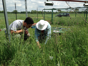
Shaun, Mark, Elizabeth, and Jen are scientists in Michigan who wanted to know if higher temperatures would lead to earlier flowering dates for plants. They chose to look at flowers of dame’s rocket, a leafy plant that is related to the plants we use to make mustard! Mark planted dame’s rocket in eight plots of land. Plots were randomly assigned to one of two treatments. Half of the plots were left to experience normal temperatures (normal), while the other four received a heating treatment to simulate climate change (heated). Air temperatures in heated plots increased by 3°C, which mimics climate change projections for what Michigan will experience by the end of the century. Mark, Elizabeth, and Jen measured the date that each plant produced its first flower, and the survival of each plant. The scientists predicted that dame’s rocket growing in the heated plots would flower earlier than those in the normal plots.
Featured scientists: Shaun Davis from Thornapple Kellogg Middle School and Mark Hammond, Elizabeth Schultheis, and Jen Lau from Michigan State University
Flesch–Kincaid Reading Grade Level = The Reading Level 3 activity has a score of 9.2; the Level 1 has a 6.4.

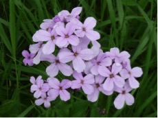
Flowers of Hesperis matronalis (dame’s rocket), a species of mustard that was introduced to the U.S. from Eurasia.
Additional teacher resources related to this Data Nugget include:
- If you would like your students to interact with the raw data, we have attached the original data here. The file also includes weather data over the course of the experiment if students want to ask and explore independent questions.
- For a lesson plan that uses citizen science phenology datasets to examine changes in phenology over 30+ year timespans, and address the scientific question, “Do we see evidence for climate change in the phenology of plants and animals?”, click here.
- Many phenology datasets are freely available online (many collected by citizen scientists). These datasets are extremely useful because scientists (and your students!) can examine average trends in timing shifts over periods of decades and often in different regions. Phenology datasets available online:
- Lilac flowering phenology dataset
- Ice cover duration for two Michigan lakes
- Nature’s Notebook: A national plant and animal phenology observation program, where students can contribute their phenology data
- ebird: A global bird observation program through Cornell University, students can become citizen scientists and enter data on local bird counts
- hummingbird.net: A place to learn about attracting, watching, feeding, and studying the hummingbirds that breed in North America
- NY Times article on research showing what happens when climate change shifts phenology – “5 Plants and Animals Utterly Confused by Climate Change“
- Webinar, hosted by Data Nuggets and DataClassroom, exploring the research and data behind this activity.
- Webinar exploring how plants respond to climate change, featuring this Data Nugget and LTER scientists!


The other thing that would be great – I’m planning to use the Level 1B version, but I will have to remake the handout to save paper – I can already print just a class set for the article for kids to read – but I really don’t want to have to use 2 full pieces of paper (back and front) – so I will modify it to a google doc to fit almost all the same questions and the place to draw in the bar chart, but so that it will all fit on one piece of paper back and front. (I have about 110 students – so for daily sort of work, I try not to use more than 1 piece of paper or do it electronically instead) – because I wanted to save the paper, I couldn’t use it as is, and therefore I didn’t use it today – I will have to spend more prep time before I’m ready to use the lesson.
but for the first bar chart of the year, I think it is helpful to have the students fill it out on paper before I start using DataClassroom (plus, DataClassroom’s wizard is suggesting a histogram instead of a bar chart)….so anyway, instead of using it as an intro to ecology lesson, I may wait and do it later in the year when we get to climate change